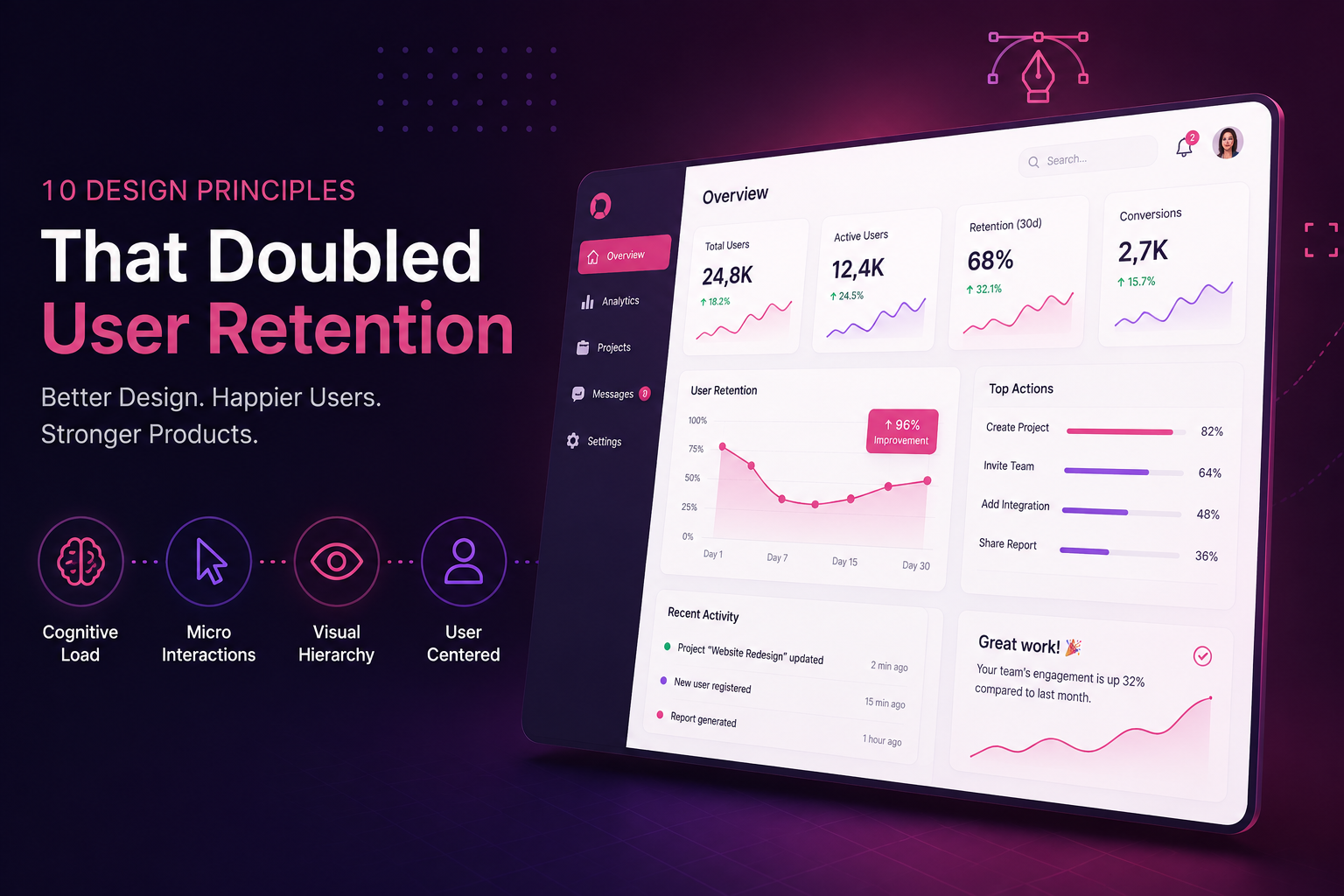
A client came to us with a SaaS dashboard that had good underlying functionality but a churn problem — users signed up, poked around for a week, and quietly disappeared. Nothing was technically broken. The product was simply exhausting to use. Over one redesign cycle, applying the ten principles below took 30-day retention from just over a third of signups to nearly double that. None of the changes were exotic; all of them were disciplined.
1–3. Reduce Cognitive Load First
Before touching color or type, we audited every screen for decisions the user was being forced to make that the product could make for them. Three changes had the biggest impact:
- Progressive disclosure — advanced settings were moved behind an "Advanced" toggle instead of sitting in the main flow, cutting the average onboarding screen from 14 visible fields to 5.
- One primary action per screen — every screen previously had two or three buttons competing for attention. We picked one visual hierarchy per screen and demoted everything else.
- Sensible defaults — instead of an empty form, new users landed on a pre-filled example so they could see the product working before configuring anything themselves.
"Every field you don't ask for is a decision the user doesn't have to make. Retention is often just the accumulation of decisions you removed."
4–6. Micro-Interactions That Confirm, Not Decorate
The old dashboard had almost no feedback on user actions — a save button that gave no confirmation, a delete that happened instantly with no undo. We rebuilt the interaction layer around three rules:
- Every destructive action gets a brief, reversible undo window instead of a confirmation dialog that interrupts flow.
- State changes (saved, syncing, error) are shown inline, near the element that changed, not in a toast that disappears before it's read.
- Loading states use skeleton screens that mirror the real layout, rather than a generic spinner, so the interface never visually "jumps" once data arrives.
7–8. Visual Hierarchy Tied to User Goals
We rebuilt the type scale and color system around what users actually needed to notice first, second, and third — not around what the engineering team had built first. The result was a smaller, more disciplined palette: one accent color reserved exclusively for primary actions and success states, so it was never diluted by decorative use elsewhere in the interface.
The dashboard's headline metric used to be styled the same size as five other numbers on the page. Increasing its weight and giving it the only warm accent color on the screen was, on its own, associated with a measurable increase in daily return visits — because users could finally tell at a glance whether things were going well.
9–10. Treat Empty States and Errors as Design Surfaces
The original product's empty states were blank white boxes with no explanation. Errors were raw and unhelpful. We rewrote both:
- Empty states now explain what will appear once an action is taken, with a single clear call to action — turning a dead end into a next step.
- Error messages describe what happened and how to fix it, in plain language, instead of a generic failure message.
Together, these ten changes weren't a visual refresh — they were a systematic removal of friction at every point a user might otherwise quietly give up. That discipline, more than any single design trend, is what moved the retention number.